With the corporate world growing more and more day by day, job seekers need to be innovative and extra creative to get noticed by employers.
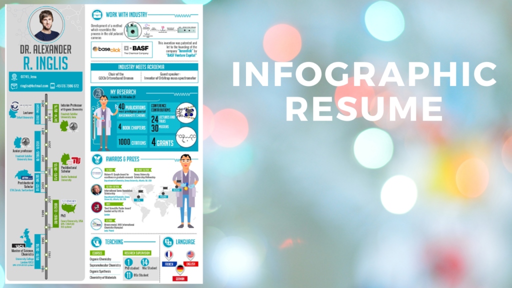
Infographic CV is the best option for this to be unique in the crowd, which is nothing but a visual representation of your work history and skills.
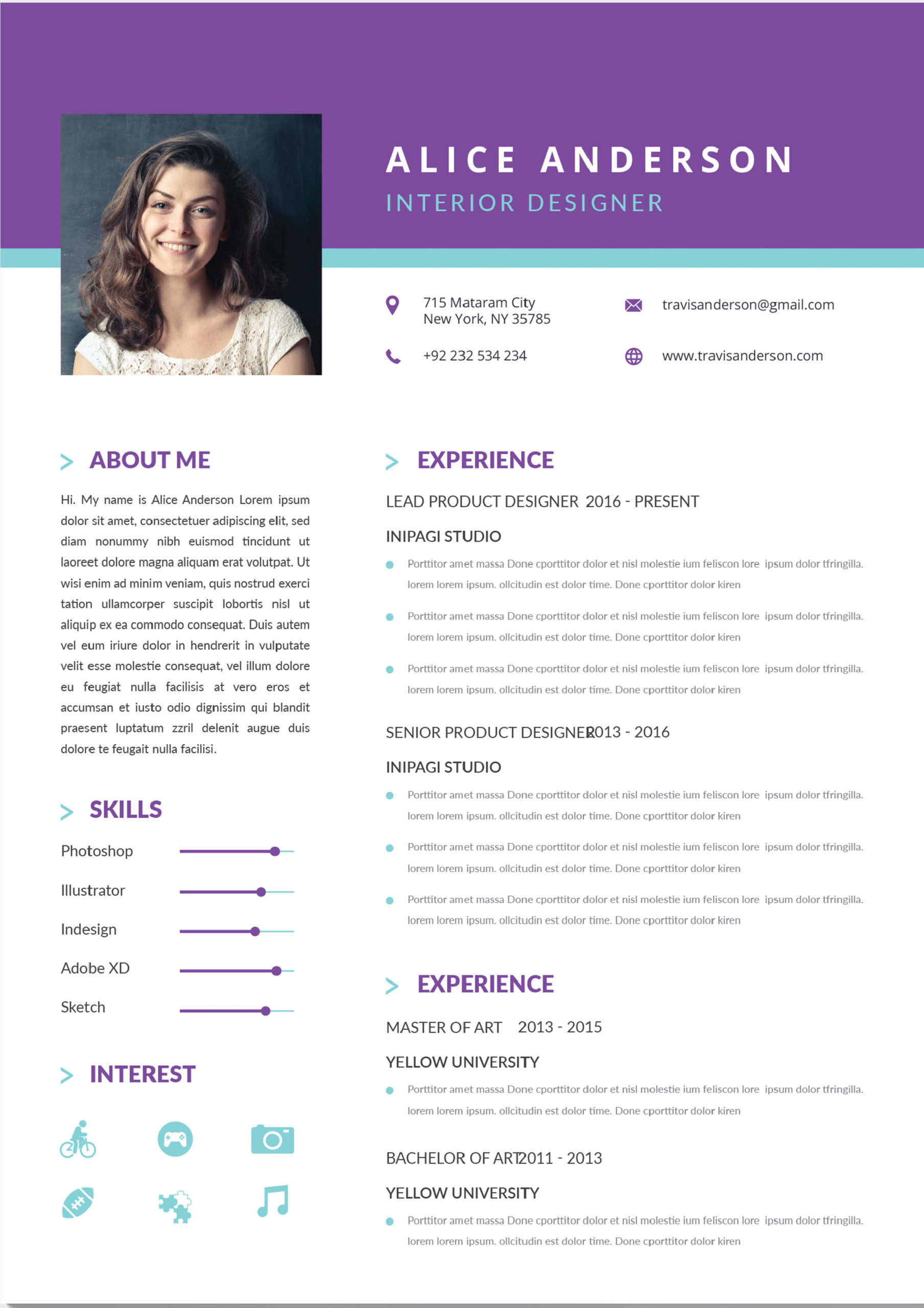
A standard resume will reflect your whole profile in text format, Whereas the infographic resume uses to demonstrate your profile using images such as graphs, charts, and icons to explain your
career summary. This visual representation helps interviewers easily focus on your resume to make a solid first impression.
Here, look at why you should have an infographic resume:
Easily discoverable:
It’s a minute of time of your interview, which judges your eligibility for the job. Your infographic resume easily grabs the interviewer’s attention in this limited time. An infographic resume may be visual relief to the hiring manager including many elements to make it attractive and makes you special from the group.
Easily Readable:
No hiring manager spends examining the candidate’s resumes. Your infographic resume helps to catch the recruiter’s eyes since your data is laid out in sections with icons and graphics which is easily scannable. Instead of writing a lengthy paragraph, an infographics resume allows the hiring manager to quickly identify what is most special about you as an applicant.
Shows your creativity:
Your infographic CV resume reflects your creativity to be unique in a group. Infographics are not only useful for resumes, they can also spice up your reporting, brand management, and social media skills. It displays your multi-faceted abilities apart from your listed skills.
Visual Resume mainly depends upon your imagination, even if you have somebody creating your resume, you will have control over how it looks. Don’t worry, the Resume booth is the ideal platform which helps you to create the best visual resume.
Understand the design elements:
Before you create your infographic resume, you must know about the elements used for data visualizations. For example, charts are used to represent the measurable data, and timelines are used to represent history.
You are free to utilize multiple visualizations in your infographic resume. By using a timeline that highlights your educational background and work experience. By using icons, display a number of related skills in a coherent way. Don’t use too many design elements in your resume, which makes your resume ugly. It should help the recruiter to read the information provided clearly with any complex diagrams.
Choose The right colours:
You have down the structure, among the most important decisions would be to select the right colour. It’s essential that do not go with a bunch of colours. Adding too many colours to your resume will make the resume unprofessional. You can always choose to use a dark colour text on a white backdrop. Although it’s tempting to use your preferred colour, remember that your resume is not for you — it’s for your prospective companies.
Maintain it Simple:
Finally, and above all, keep it simple to read. Do not use complex design elements that confuse the interviewer. Ensure, your resume Does not go into too much detail and also leaves the interviewer needing more.


 - 9840422999
 - 9840422999
 - 9840422999